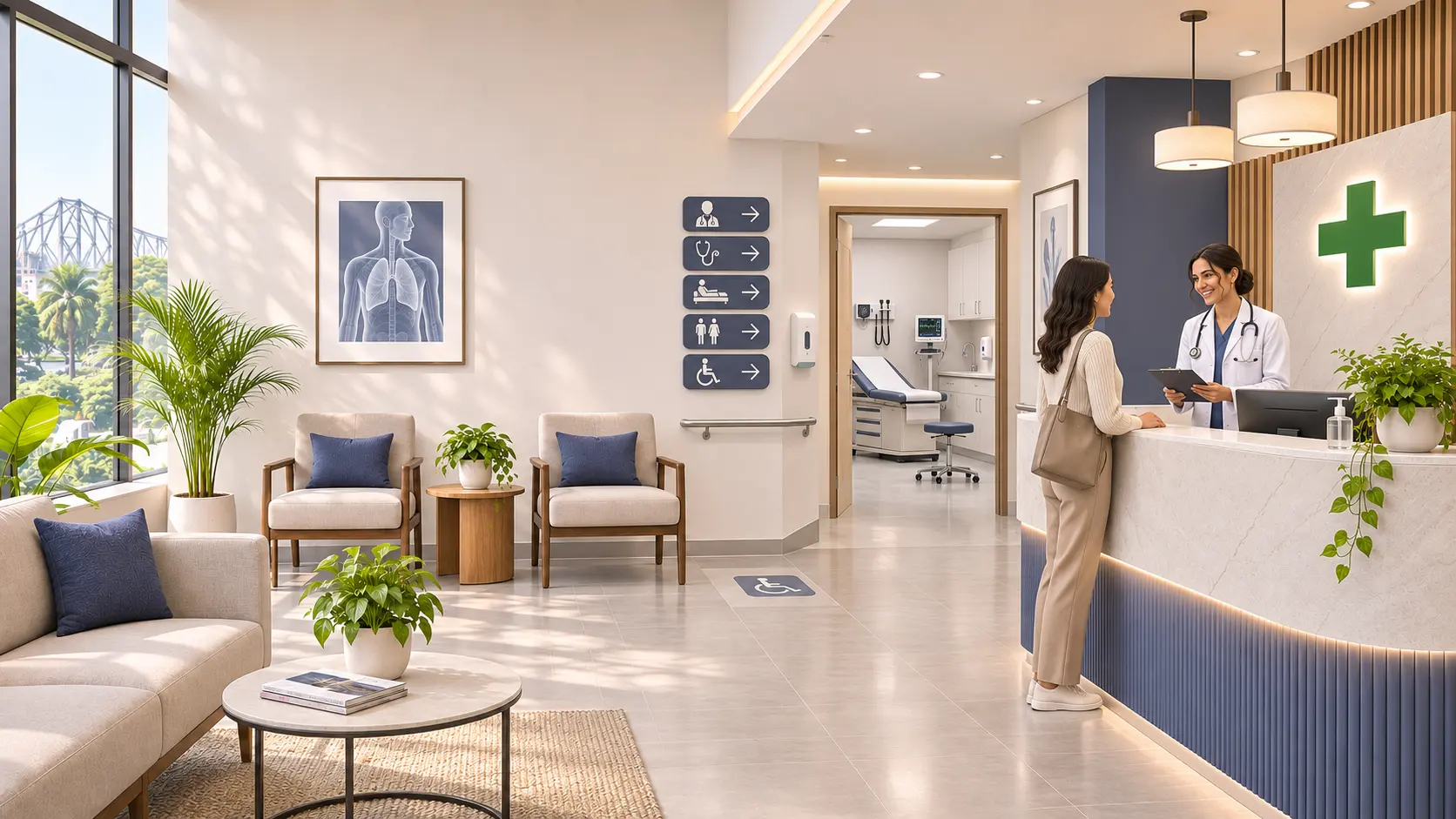
Interior Design of Medical Clinic: What Patients Notice First
Good interior design of medical clinic space does two jobs at once. It calms a nervous patient within the first ten seconds, and it lets the doctor and staff move from reception to chamber to dispensary without bumping into anyone. Get both right and the clinic feels professional without feeling like a hospital ward.
That’s the short answer. The longer one depends on your floor area, your speciality and how many patients walk in on a Monday morning.
We see the same brief again and again at Espace n Design. A doctor has taken a 400 to 900 sq ft unit in a commercial building, often in Salt Lake, Ballygunge or a Behala main road, and wants it to look “modern but not cold”. Usually there’s a deadline too, because the rent has already started. This guide covers what we actually tell those clients: the trends worth following, how to plan the doctor’s chamber, how to squeeze a safe layout out of a small unit, and where you can save money without the place looking cheap.
Quick answer for busy readers: a well-designed clinic uses warm neutral colours, layered lighting (around 4000K in clinical zones, warmer in waiting areas), joint-free, easy-clean surfaces like vinyl or quartz, and a one-way patient route from entry to reception, waiting, consultation and exit. Everything else is detail.
What are the latest trends in clinic interior design that improve patient comfort and flow?
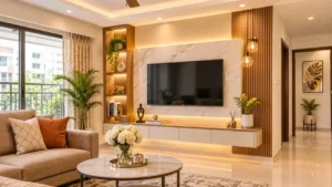
The biggest shift is away from the cold, all-white look toward clinics that feel closer to a good hotel lobby. Patients sit, wait and talk more freely in a warm room, and staff move faster when the layout separates patient areas from service areas. Here’s what we’re actually building in 2026.
Hospitality-style reception
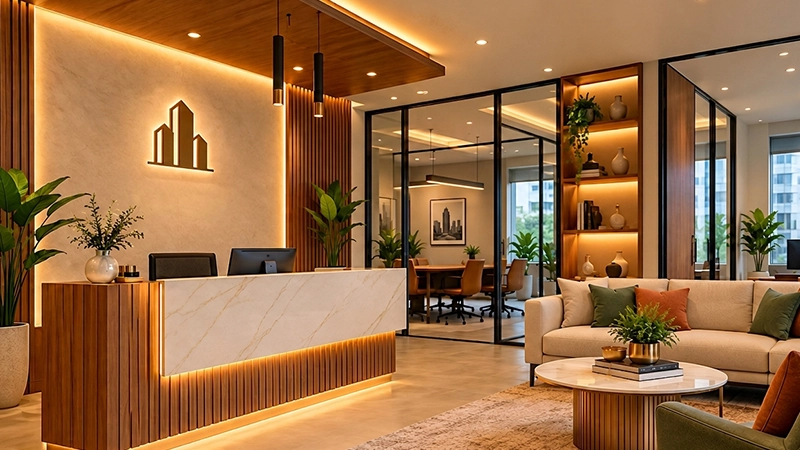
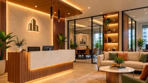
The tall, barricade-like reception counter is on its way out. Clinics now use a lower desk section (around 30 inches high) beside the standard 42-inch counter, so an elderly patient or someone in a wheelchair can sit and talk to the receptionist eye to eye. Add a soft rug zone and one statement light above the desk, and the entrance stops feeling like a ticket window.
Zoned layouts with a one-way route
This is the trend that matters most for flow. Patients enter, register, wait, consult and leave without doubling back past the queue. Doctors and staff get a separate rear passage to the chamber, pantry and store. Even a 600 sq ft clinic can manage a loop if the chamber has two doors. We’ve redesigned clinics where simply moving the dispensary from beside the entrance to the exit side cut the crowding at the door almost overnight.
Biophilic touches that don’t need watering every day
Nature in the room genuinely helps. A widely cited 1984 study in Science by Roger Ulrich found that surgical patients whose windows looked onto trees had shorter post-operative stays and needed fewer strong painkillers than matched patients facing a brick wall. A clinic visit is much shorter than a hospital stay, of course. Still, a planter wall, a moss panel or a large window left uncovered does more for a waiting patient than another framed certificate.
Warm minimalism
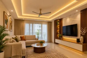
Wood-look laminates, fluted panels, curved edges and muted colours like sage, sand and soft clay are replacing glossy white everywhere. Rounded corners aren’t only a style choice. They’re safer for children and elderly patients who might stumble.
Quiet tech
Token display screens, QR check-in stands, concealed charging points under the waiting seats and a proper slot for the computer in the chamber. Planned early, the cables disappear inside the furniture. Planned late, they hang everywhere.
Acoustic privacy
Indian clinics often ignore this one. If patients in the waiting area can hear the consultation, they’ll hold back symptoms. A solid-core chamber door, a gypsum partition filled with rock wool and a little soft furnishing outside fix most of the problem.
Interior design of doctors chamber: the room that builds trust
The interior design of doctors chamber spaces should put the patient at ease, keep everything hygienic and let the doctor work for eight hours without back pain. In practice that means a clean consultation desk, two comfortable patient chairs, a screened examination bed, good task lighting and storage that keeps files and instruments out of sight.
Most chambers we’re asked to redo are between 100 and 140 sq ft. That’s enough, if you plan it properly.
Start with desk placement. Put the doctor’s desk so the doctor faces the door and the patient sits at a slight angle rather than directly across. Across-the-desk seating feels like an interview. A corner or L-shaped desk lets the doctor turn the monitor toward the patient when explaining a report, which patients appreciate more than you’d think.
Keep the examination bed along the wall furthest from the door, behind a ceiling-track curtain or a sliding frosted panel. Leave at least 2.5 ft on one side of the bed so the doctor can stand and work. A wall-mounted BP unit and a small hand-wash basin nearby save a lot of walking.
Plan for two patient chairs, not one. Most patients in India come with a family member, and a person left standing makes the consultation feel rushed. Choose chairs with arms, because elderly patients push on them to stand up.
For storage, closed shutters in matt laminate beat open shelves. Open shelves collect dust in a Kolkata monsoon and look cluttered within a month.
Lighting needs three layers here: a 4000K ceiling panel for general light, a focused light over the exam bed, and one warm accent (a wall sconce or a backlit panel behind the desk) to soften the room.
One mistake we see constantly: doctors spend heavily on a striking reception and then squeeze the chamber with leftover budget. Patients spend most of their clinic time in the chamber. It deserves at least as much thought as the front desk.
How can I maximise small clinic spaces with efficient, safe interior layouts?
Start with zoning, not furniture. Small medical clinic interior design works when every square foot has one clear job and patients never cross paths with clean supplies or waste. Divide the plan into a public zone (entry, reception, waiting), a clinical zone (chamber, procedure or dressing room) and a service zone (store, pantry, toilet), then connect them with the shortest possible route.
A typical split we use for a 500 sq ft single-doctor clinic looks like this:
| Zone | Approx. share of floor area | What goes in it |
|---|---|---|
| Reception and waiting | 35 to 40% | Counter, 8 to 10 seats, token screen, water point |
| Doctor’s chamber | 25 to 30% | Desk, two chairs, exam bed, wash basin |
| Procedure or dressing room | 10 to 15% | Couch, trolley, sharps and waste bins |
| Service (toilet, store, pantry) | 15 to 20% | Accessible toilet, medicine store, small pantry |
| Circulation | Whatever remains | Keep main passages at least 4 ft wide |
A few space-saving moves that consistently work:
- Wall-mounted or cantilevered waiting benches instead of chairs on legs. The floor looks bigger and cleaning is faster.
- Sliding or pocket doors for the chamber and toilet, so no door swing eats into a 4 ft passage.
- Full-height storage in the reception back wall, which handles files, the printer and a router in one strip.
- Mirrors or a glass partition with frosted film at eye level. Light passes through, privacy stays.
- A fold-down writing ledge in the procedure room in place of a second desk.
Safety isn’t optional in a small unit. Keep the exit route clear and lit, use anti-skid flooring near the wash basin and toilet, add a grab bar in the toilet, and make sure a stretcher or wheelchair can turn inside the waiting area. If the building has a step at the entrance, a small ramp with a handrail is worth fitting even if the landlord grumbles.
Honestly, the most common problem in small clinics isn’t size. It’s a reception desk placed right at the door, so everyone queues in the entrance. Move it a few feet in and the whole clinic breathes.
Which materials, colours and lighting create a clean, professional clinic on a budget?
Use durable, easy-clean materials that only look expensive: vinyl or large-format vitrified tiles on the floor, washable low-VOC emulsion on the walls, laminate over plywood for furniture and a warm-neutral colour palette lit by bright, glare-free LED panels. That combination gives you a clinic that photographs well and survives daily disinfecting.
Here’s how we’d spend a tight budget, and where we’d refuse to cut corners.
| Element | Budget pick | Why it works | Avoid |
|---|---|---|---|
| Flooring | Sheet vinyl or LVT; 2×4 ft vitrified tiles | Few joints, quick to mop, vinyl is softer underfoot | Small tiles with many grout lines |
| Walls | Washable low-VOC emulsion, PVC or laminate panels below 3 ft | Takes repeated wiping, low smell for sensitive patients | Textured paint (traps dirt) |
| Furniture | BWP plywood with matt laminate, rounded edges | Moisture resistant, easy to sanitise | Fabric chairs in the waiting area |
| Counters | Quartz or solid surface | Non-porous, no stains from sanitiser | Raw granite, polished marble |
| Ceiling | Gypsum board with a simple cove | Hides wiring, holds LED panels and AC vents | Heavy POP mouldings |
Colour comes next. Warm whites, greige, pale sage and soft blue keep the room calm, and a single accent wall in the brand colour gives the clinic identity without shouting. Paediatric clinics can go brighter with yellow or coral, but keep it to one wall or the furniture. Too much red or bright orange in an adult clinic tends to raise tension rather than lower it.
Lighting is where cheap clinics give themselves away. Flickering tube lights and a single bright panel make everyone look unwell. Go for layers instead: 4000K neutral light in the chamber and procedure room so the doctor sees true skin tones, warmer 3000K light in the waiting area, and indirect cove lighting along the ceiling edge to soften shadows. Choose LED fittings with a CRI of 90 or above in clinical rooms. The cost difference is small and the doctor will notice it every day.
One place not to save money: the electrical work behind all of this. Separate circuits for equipment and a proper earthing check matter far more than the brand of tiles.
Practical decor ideas for a doctor’s clinic that looks modern and welcoming
A modern doctor’s clinic should feel clean and calm without looking like a hospital. The easiest way to get there is to borrow a few ideas from homes and hotels and apply them with medical-grade materials. These are the decor moves we use most often in the interior of clinic projects, roughly in order of impact for the money:
- A branded welcome wall. The clinic name in brushed metal or backlit acrylic letters on a fluted or wood-texture panel behind reception. It’s the first photo patients take, and it’s the cheapest way to look established.
- Indoor plants that tolerate low light and air conditioning, like ZZ plant, snake plant and pothos. Two or three large planters beat ten small pots.
- Local artwork instead of stock posters. A clinic in Kolkata can use Kalighat-style prints, terracotta panels or framed photographs of the neighbourhood. It gives patients something to look at besides the clock.
- A kids’ corner, even a small one. A low table, washable wall decals and a few wipe-clean toys keep children busy and parents grateful.
- Wayfinding that’s actually readable. Large room numbers, simple pictograms and a colour strip on the floor or wall that leads to the chamber. Most first-time patients are anxious and appreciate not having to ask.
- Soft upholstery on the waiting benches in leatherette, which looks warm but still wipes clean.
- Health information on a single framed board or a screen, not taped to every wall. Pinned papers make even an expensive clinic look tired.
One small touch that patients mention more than anything else is a proper water station with paper cups and a tissue box beside it. It costs almost nothing.
Speciality matters too. A dermatology or aesthetic clinic can lean towards a boutique, almost salon-like feel with mirrors and softer lighting. A paediatric clinic needs colour and durability. A physiotherapy clinic needs open floor and mirrors more than decor. If your clinic is part of a larger healthcare or wellness space, our commercial interior design team plans the clinic and the surrounding offices or shops as one project, so the look stays consistent.
Doctor clinic design mistakes we fix most often
After enough clinic projects, the same problems start to repeat. If you’re planning a new clinic or a refit, check your drawings against this list before the carpenter arrives.
- The wash basin is outside the chamber. Doctors end up walking out between patients, and patients notice.
- Too few power points. A modern chamber needs sockets for the computer, printer, ECG or BP machine, phone charger and sometimes a small fridge. Plan at least six.
- Glossy floors. They look smart on handover day and turn slippery the first time someone walks in from the rain.
- No space for the queue. In a busy OPD, 20 people can arrive in an hour. If the waiting area seats eight, the rest stand in the corridor and the landlord complains.
- AC vents blowing straight onto the exam bed. Patients lying down feel the cold first.
- Forgetting the signage outside. Half of a clinic’s first impression happens in the building lobby.
How much does clinic interior design cost, and how long does it take?
Cost depends mainly on area, the number of rooms, the speciality (a dental or dermatology setup needs more plumbing and electrical work than a GP chamber), the materials you choose and whether you need civil changes like new partitions or a toilet. A simple refresh of an existing clinic costs far less than a shell-to-finish fit-out.
For a realistic figure on your own space, try our interior cost estimation tool. You answer a few questions about the property and scope, and a designer follows up with a personalised estimate instead of a generic number off a brochure.
On timelines, a 500 to 800 sq ft clinic usually takes four to eight weeks from final drawings to handover, depending on civil work and how quickly material choices are approved. The design stage before that often takes one to two weeks. We tell doctors to start the design conversation before signing the lease if possible. A quick site visit can reveal a beam, a low ceiling or a missing drain point that changes the whole layout.
Planning a clinic? Talk to a designer who has done it before
Espace n Design is an interior designer in Kolkata that plans clinics, doctor’s chambers and healthcare spaces alongside homes and offices. We’ll visit the site, draw a patient-flow layout, show you material samples you can actually touch and give you a clear scope before any work begins.
Call or WhatsApp +91 90517 85452 to book a free consultation, or send us your floor plan and we’ll suggest a first layout for your clinic.
FAQs on clinic interiors
What is the best colour for a medical clinic interior?
Warm whites, soft greige, pale sage and light blue are the safest choices. They read as clean and calm. Add one accent in your brand colour so the clinic doesn’t feel anonymous.
What are some simple clinic ideas for a new practice?
Keep the patient route one-way, put the reception a few feet inside the door, use vinyl flooring and laminate furniture, add two or three large plants and invest in good lighting. Those five things make a bigger difference than any decorative feature.
How big should a doctor’s chamber be?
About 100 to 140 sq ft is comfortable for a desk, two patient chairs, an exam bed and a wash basin. You can manage in 80 sq ft if the exam bed sits in a separate small room.
Which flooring is best for a clinic?
Sheet vinyl is our first pick because it has almost no joints, feels soft underfoot and handles daily disinfectant. Large vitrified tiles with a matt, anti-skid finish are a good lower-maintenance alternative.
Can I design a clinic in 300 sq ft?
Yes. A 300 sq ft clinic can fit a small reception with five or six seats, a compact chamber with a curtained exam bed and a toilet, as long as you use sliding doors and wall-mounted furniture. It works best for a single doctor with appointment-based visits.
Do clinic interiors need to follow any rules?
They do. Requirements change by state and speciality, so check with your local health authority and the building society before finalising. Common points include fire exits, biomedical waste storage, accessible toilets and ventilation in procedure rooms. A designer who has done clinic work will plan for these from the start.
How do I make my clinic feel less like a hospital?
Swap white tube lights for warmer layered lighting, bring in wood textures and plants, use upholstered (wipe-clean) seating and hide equipment and files behind closed storage. Patients relax when the room looks cared for rather than clinical.